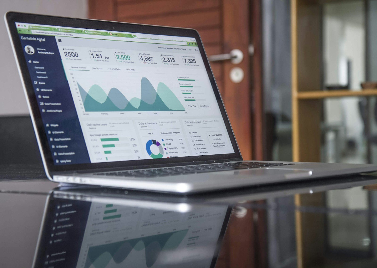
Learning how to present capstone results with tables and figures helps readers see the evidence without searching through dense paragraphs. A useful display does more than decorate the results section: it answers a defined question, shows the relevant comparison, and makes denominators, units, time periods, and uncertainty visible. For working professionals completing an applied project, planning displays early can also reveal gaps in data collection before those gaps become impossible to correct.
Begin With the Question, Not the Chart
Return to each approved research question, evaluation aim, or project objective. Write the single result a reader needs in order to answer it. Then decide whether prose, a table, a figure, or a combination communicates that result most clearly.
Use prose for a small number of simple findings. Use a table when readers need exact values or several variables. Use a figure when the pattern, trend, distribution, or comparison matters more than individual numbers. A display should earn its space by making the evidence easier to interpret.
Do not select a visually impressive chart and then search for data to fill it. The display type must follow the question, measurement level, design, and intended comparison.
How to Present Capstone Results With Tables and Figures
Create a display map before final analysis. For each question, list the planned descriptive statistics, inferential or qualitative result, display type, title, key labels, and interpretation boundary.
A practical workflow is:
- Confirm the analysis and the population represented.
- Choose the smallest display that answers the question.
- Draft the title, labels, units, denominator, and notes.
- Build the table or figure from verified results.
- Check accessibility, accuracy, and consistency.
- Refer to the display in the text and state the main finding.
Follow your program’s template and required style guide. The general principles below improve clarity, but local requirements control numbering, titles, notes, placement, and formatting.
Use Tables for Exact Values and Multiple Measures
Tables are useful for sample characteristics, operational measures, category counts, pre-post summaries, model results, and comparisons across several groups. Organize columns and rows so readers can make the intended comparison without mentally rearranging the data.
Put comparable values in the same column, use a consistent number of decimal places, and include the sample size or denominator where it can change. Report units in the heading rather than repeating them in every cell when appropriate.
Avoid using a screenshot of a spreadsheet or software output. Rebuild the table so it contains only relevant results, follows the required style, and remains readable. Raw output often includes unnecessary settings, codes, or statistics that distract from the question.
Choose Figures for Patterns and Trends
A line chart can show change across ordered time points. A bar chart can compare categories when the scale begins at a defensible baseline. A scatterplot can show the relationship between two continuous variables. A box plot or distribution plot can reveal spread and unusual values that a mean alone hides.
Pie charts are difficult to compare when categories are numerous or similar. Three-dimensional effects can distort apparent size. Decorative icons, gradients, and excessive color can compete with the evidence.
Select the form readers can interpret accurately. A plain chart with strong labels is usually more effective than a complicated dashboard.
Write Titles That Explain the Display
A title should identify what is shown, who or what is represented, and the relevant period or condition. “Survey Results” is too broad. A title such as “Mean Confidence Scores Before and Four Weeks After Training” gives the reader a usable frame.
Define abbreviations and symbols in a note unless the required style permits or expects another treatment. State the source of benchmarks or comparison data. Explain calculation rules that are necessary for correct interpretation.
Number tables and figures in the order first mentioned. Check that every in-text reference points to the correct display and that no display is left unexplained.
Make Denominators and Missing Data Visible
Percentages need denominators. If 75 percent completed a process, readers should know whether that means 3 of 4 or 150 of 200. When the number of observations varies by measure, report the relevant n instead of presenting a single sample size that appears to apply everywhere.
Explain important missingness and exclusions in the text or a display note. Do not fill blank cells with zero unless zero is the verified value. A dash, “not available,” or another defined notation may be more accurate.
If attrition changes the group across time, make that change explicit. A trend based on different participants at each point may require a different interpretation from repeated measures on the same participants.
Show Uncertainty and Practical Meaning
Where appropriate, include confidence intervals, variability, or another indicator of uncertainty. Error bars must be defined; readers should not have to guess whether they represent a standard deviation, standard error, range, or confidence interval.
Do not allow a compressed axis to exaggerate a small difference. Conversely, do not use such a wide scale that a meaningful pattern disappears. Choose scales that support accurate interpretation and disclose relevant limits.
Statistical significance should not be the only message. Show the size and direction of the result, its precision, and the threshold or benchmark that gives it practical meaning.
Present Qualitative Results Clearly
Qualitative results may use a theme table, conceptual model, process diagram, or joint display. A theme table can list each theme, a concise definition, supporting categories, and a brief de-identified quotation.
Do not turn participant quotations into a substitute for analysis. Explain the pattern, variation, and negative or divergent cases, then use quotations to illustrate the interpretation.
Protect confidentiality. Remove identifying details and consider whether a distinctive role, event, or combination of characteristics could reveal a participant even without a name.
Integrate Mixed-Methods Displays
A joint display can place quantitative results beside qualitative explanations, areas of convergence, or contradictions. It should make the integration visible rather than presenting two disconnected result streams.
Define the organizing unit, such as objective, group, time period, or implementation outcome. Use neutral language when sources disagree. A contradiction may reveal differences in measurement, experience, timing, or implementation that deserve discussion.
Keep the display readable. If integration requires a page of tiny text, divide it into focused displays and explain the relationship in prose.
Write Results Text Around the Display
Introduce each display before it appears and state the main finding after or around the reference. Do not repeat every cell in prose. Direct the reader to the pattern that answers the question.
Keep interpretation proportional in the results section. Explain what the data show; reserve extended comparison with literature, implications, limitations, and recommendations for the discussion unless the program specifies otherwise.
For help planning the analysis behind each display, see our guide on writing a capstone data analysis plan.
Design for Accessibility
Use sufficient contrast, readable type, and labels that do not depend only on color. Combine color with direct labels, line patterns, shapes, or position. Avoid red-green distinctions as the only signal.
Write meaningful alternative text when the submission format supports it. Describe the purpose and key pattern, not every decorative detail. Ensure tables use true rows and columns rather than images so assistive technology can interpret them.
Test readability at the size used in the final document. A chart that works on a large monitor may fail when placed within page margins or printed.
Run a Display Accuracy Audit
- Values match the verified analysis output.
- Totals, percentages, and denominators reconcile.
- Titles, labels, units, and time periods are complete.
- Notes define abbreviations, symbols, and uncertainty.
- Axes and scales do not distort the pattern.
- Confidentiality and accessibility requirements are met.
- The text cites the correct display and avoids duplication.
Where possible, compare the final displays against the analysis file and ask a careful reader to explain what each one communicates. If their interpretation differs from the intended finding, revise the display rather than blaming the reader.
Frequently Asked Questions
Can I present the same data in a table and a figure?
Usually one form is enough. Use both only when each serves a distinct purpose and the program permits the duplication.
How many tables and figures should a capstone include?
Use the number needed to answer the approved questions clearly. Follow page limits, rubric requirements, and any guidance about moving supplementary detail to appendices.
Should I copy charts directly from statistical software?
Only if the output is accurate, accessible, relevant, and compliant with the required style. Often it should be simplified and reformatted before submission.
Need help turning capstone results into clear, defensible displays? Academic coaching can help you plan tables, figures, and results text while you remain responsible for your data, analysis, interpretation, approvals, writing, and submission. Chat on WhatsApp.